

The complete overhaul to LinkedIn’s desktop platform and the roll-out to its users is nearing its conclusion. A week ago I got upgraded, which for a LinkedIn marketer couldn’t come sooner. So what’s the good, the bad and the ugly of LinkedIn 2017?
![]()
The design has been updated to be cleaner with less navigation options and is more in line with the mobile version. Visually it is more appealing.

The search has been simplified with less search options. Simplified does not always mean better. There are search options that are now no longer available in both the free and the Premium accounts making it slightly more difficult to target your prospects. These options are available in Sales Navigator which is LinkedIn’s sales product.
![]()
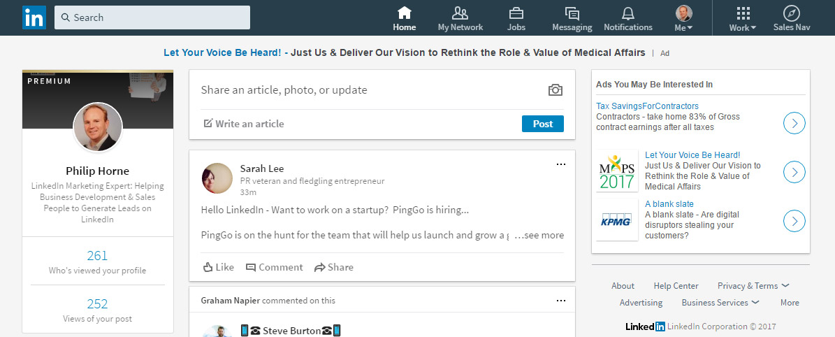
As with the whole site, the home page is cleaner. On the left hand side, you see an overview of your profile with your profile photo, headline, and statistics for people who have viewed your profile and views of recent articles which is useful.
Next to this in the centre is the content marketing element in which you can share updates (to your or others’ content) or add an article that helps to educate and inform your 1st connections and the wider LinkedIn community. The home feed is below this section and looks visually appealing. Overall the home section feels a little less cluttered.
![]()
The My Network section is the result of bringing together a number of sections into one area, but has been done so in a way that doesn’t make the section feel cluttered. Within this area you can view current connections, view received invitations and also ‘People you may know’.
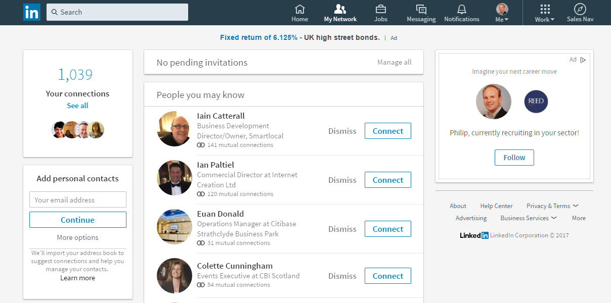 However, there have been notable losses. Tags, which were useful for organising connections into different segments that could then be used to send different messages to these groups, have been removed. However, these tags can be accessed externally to LinkedIn via a database download on the link https://www.linkedin.com/psettings/member-data. Within this download you will also get a list of the email addresses of your connections which can be imported into a mailing tool. The other loss is the sort functions which have been limited to just ‘Recently added’, ‘First Name’ and ‘Last Name’.
![]()
The jobs section is very similar to the old Jobs section, although the Discover and Preferences tabs have been removed.
![]()
The main messaging section is reasonably similar to the old version. I did like in the old messaging that you could easily see who was the last respondent on a messaging thread and whether you needed to respond because the preface ‘You:’ was at the front of the message. This is not a huge deal, but if you have a very active account it can take you a little longer to identify the messages that need responding to.
NB Top tip – click on the 3 squares to view an overview of the profile of the person messaging you. From there you can click to view their profile. I got asked how to do this by a client today.

LinkedIn have added a new real-time messaging interface, which allows users to message a connection wherever they are on LinkedIn. Within this there is a useful option to have pop-ups activated that alerts you to new incoming messages from connections.
![]()
![]()
The notifications section is better in the new LinkedIn. In the old LinkedIn it was easy to miss opportunities to interact with because it was a drop down rather than a page, but also on the old LinkedIn it didn’t show as many notifications.
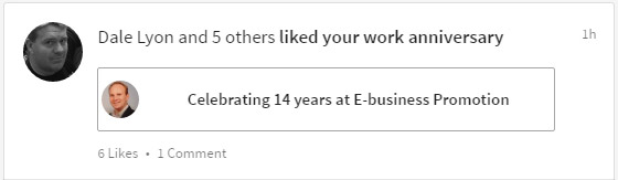
The notifications section now contains the congrats notifications (Happy Birthday, work anniversary and new job messages); 1st connections published articles; who has liked articles, updates or congrats messages; endorsements for skills; and an overview of who’s viewed your profile (with link to section). A great section for interacting and build relationships with 1st connections.
![]()
The Me section is your overall management of your account. Within this section you can access links to edit your profile, manage your account settings (Privacy & subscription to paid accounts), manage your pages and access the ‘help center’.
![]()
If your job is in a client facing role then your profile should be more than just a cv of positions from your past. It is an opportunity to position yourself in front of the people you want to attract and do business with. So what are the main changes in the new LinkedIn that you should be aware of?
![]()
Both the background and profile images have changed.
The background image new image recommended size is now 1536 x 768 pixels. Check your profile on different monitor sizes to see whether the background image still works. If it doesn’t ‘work’ at different monitor settings, as with the old LinkedIn, you can reposition the image to suit. Do so and test again. The profile picture is now circular. There is less room for manoeuvre in terms of getting your face in the centre due to corners no longer being there so check your face is fully in view.
![]()
The first two lines are vital.
When someone views your profile on the new LinkedIn, only the first two lines of your summary now show, whereas on the old LinkedIn the whole Summary was displayed. Visitors to profiles now have to take action to click on ‘See more’ to view your full Summary. The Summary is your opportunity to differentiate yourself from the competition, address your target prospects pain points and let them know why you are the ideal person to help them with it (without being overly bullish). Therefore, it is vital you gain their interest so they will click.
On my profile I have led with two questions to get my profile visitors thinking and wanting to read more about me and what I could possible offer them. What questions could you ask to get your profile visitors to click to ‘See more’?
![]()
It is no longer possible to move your profile sections around
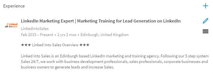
In the old LinkedIn there was a handle within each section that enabled you to drag the main sections above or below other sections. My recommendation to clients was that the order should be: Summary, Skills & Endorsements, Experience, Volunteer and Education. However, in the new LinkedIn the order is fixed. The summary name is no longer there and is contained in the header area, then comes Experience, Education, Volunteering, Skills & Endorsements.
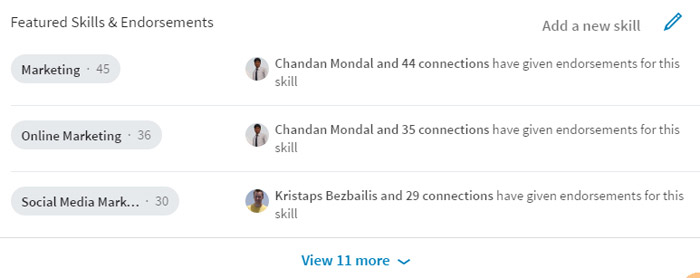
In the old LinkedIn I advised that Skills & Endorsements should be put near the top as they were a great visual representation of what you were an expert in allowing visitors to your profile to quickly get a handle on what skill set you have. However, as you can see above, Skills & Endorsements have been demoted to near the bottom. Perhaps LinkedIn downgraded them due to many people giving endorsements when they hadn’t used a person’s services. Further evidence to support this is that there are now only three skills showing in the new LinkedIn whereas in the old version ten were showing.
Recommendations are a far stronger measure of someone’s competence and in my opinion should be more prominent in the LinkedIn profile order as they provide social proof as to whether someone is good, bad or indifferent.
NB It should be noted that you can still move your experiences around by clicking on and dragging the four lines below the edit symbol within an individual experience.
![]()
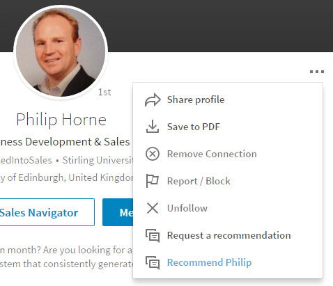
When viewing profiles of your first connections, the CRM element has been removed from the new LinkedIn. You are no longer able to view a history of your interactions and any notes you kept.
However, when viewing profiles, click on the 3 squares to view ‘hidden’ options.
![]()
The work section is a bit of a ‘mop-up’ section from the old LinkedIn as it contains many links that were in the Interests, Education and Business Services sections of the old LinkedIn. The main highlights for ‘average users’ (if there is such a thing) in this section are that you can create a company page here, find out and upgrade to LinkedIn products and look for and join groups.
![]()
In conclusion, the ‘good’ for the new LinkedIn platform is that it is simpler to use as there are less sections and so over time it will become easier for users to find the functionality they want to use (once they have re-learned the platform!). Hopefully this guide will help in some part. The ‘bad’ is, there is some functionality that has been removed from the free and premium accounts and only available in Sales Navigator. The ‘ugly’ for some people I have spoken to is that LinkedIn are giving its users a gentle nudge to spend more money with them. This for me is not strictly ugly as LinkedIn own this huge database of decision makers that it gives it users’ access to so they can find target prospects on mass. LinkedIn is a commercial enterprise and as such they need to make money to continue to exist.
Is Sales Navigator worth it? This is not a simple answer. This will dependent on whether you are serious about growing a business; whether you are a B2B company (although B2C companies can generate plenty of leads by ‘clever’ prospecting); whether you know the strategies to exploit this huge database; but also whether you have the time to implement them yourself. If the answers to these are yes (or you are open to outsourcing this task) then the answer is an emphatic yes. LinkedIn is the number one B2B lead generation platform commanding 80.33% of B2B social media channel leads (Kissmetrics).